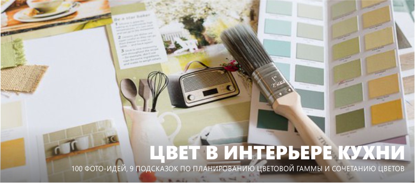
Successful kitchen design depends largely on the color scheme. But, in order to plan it correctly, one idea of the color that you would like to see in the interior is not enough. It is necessary to accurately determine the basic and additional shades, to make harmonious combinations, to place accents, to hide the flaws and emphasize the dignity of the room.
Our guide will help you choose the perfect color for your kitchen, walls, floor and decor and will reveal some of the colorist secrets of designers. And here you can get ideas or find ready-made color solutions from a selection of 100 photos of beautiful kitchens.
9 principles of color in the kitchen
1. Combine only 3-5 shades
As a rule, the background of the kitchen is made up of the largest surfaces and objects: walls, floor, kitchen set (large furniture). It is their colors in the interior palette that will be the main and most often neutral, natural and close to each other. In addition to the base colors, you can choose two or three additional colors - darker, saturated or bright.
As a percentage of the share of the main and additional colors can be divided as follows - 60/30/10. Remember that very bright and dark colors should occupy the smallest share of space - no more than 10%, that is, only as accents and color spots.
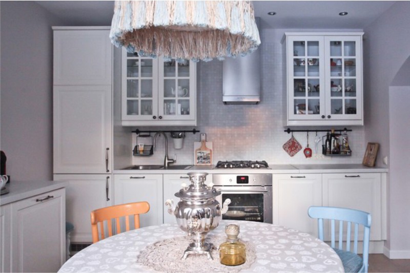
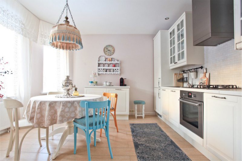
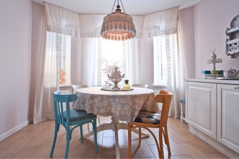
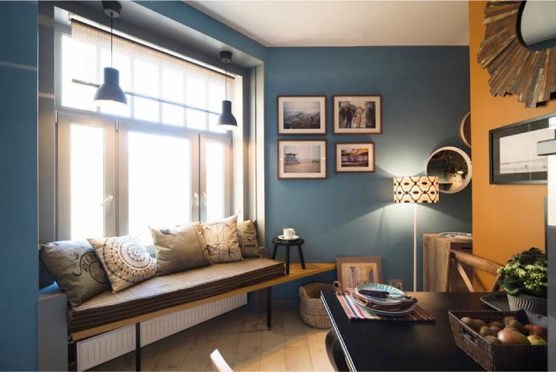
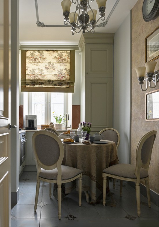
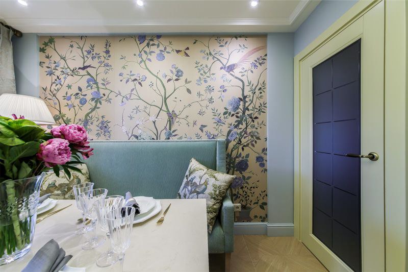
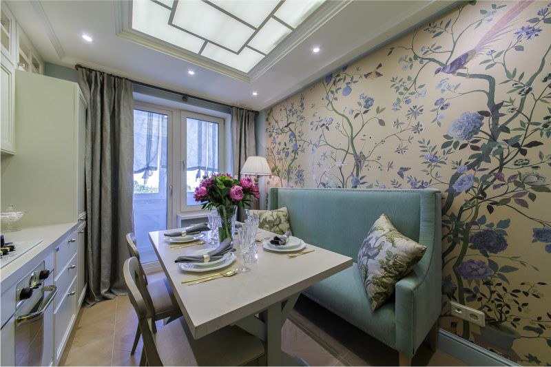
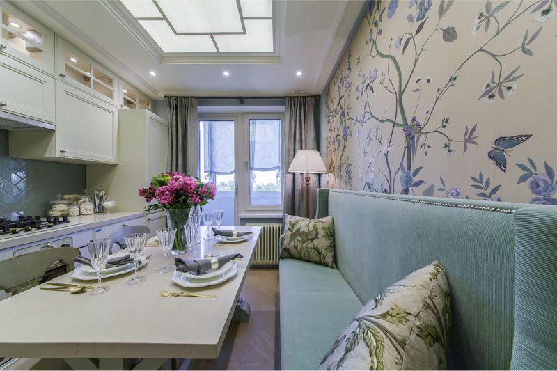
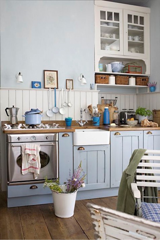
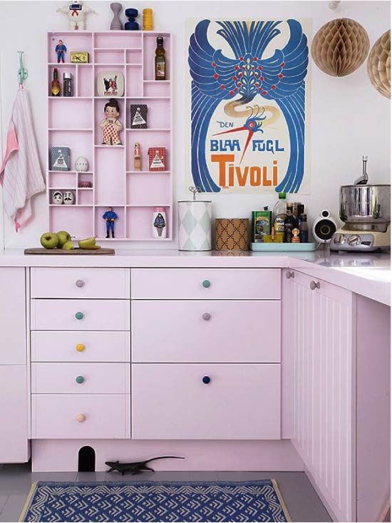
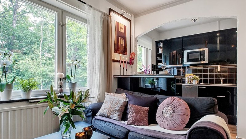
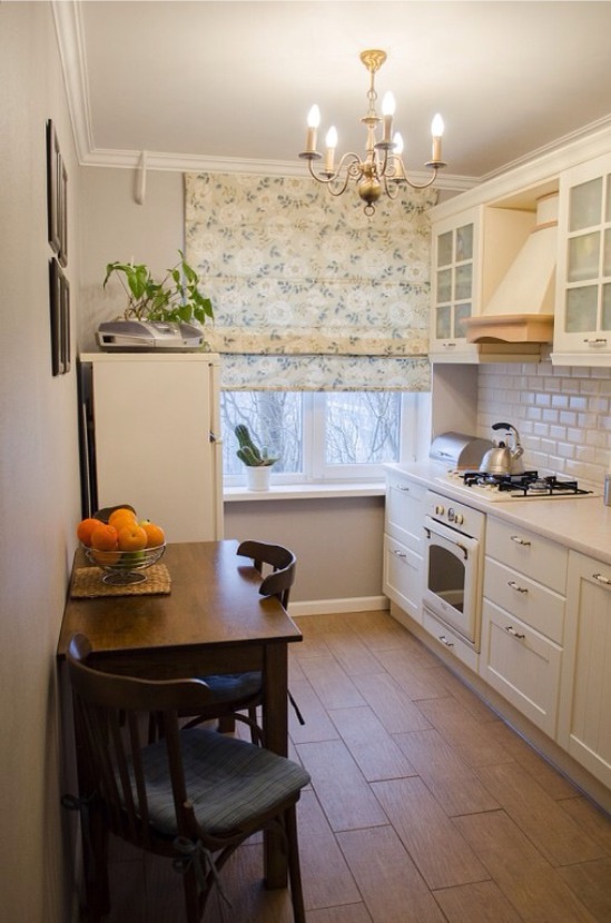
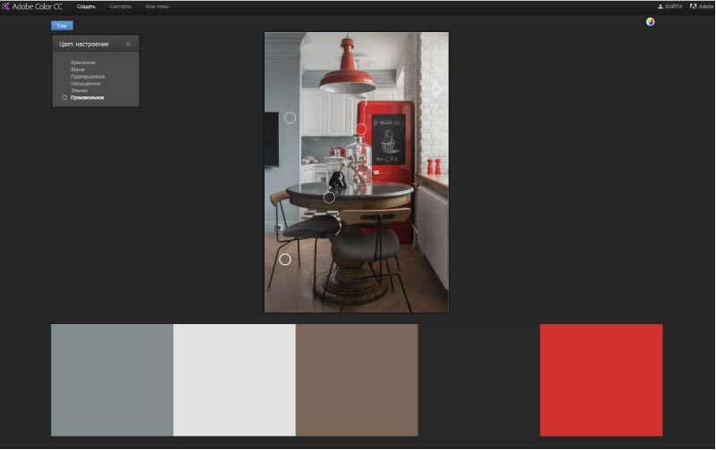
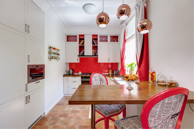
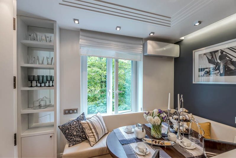
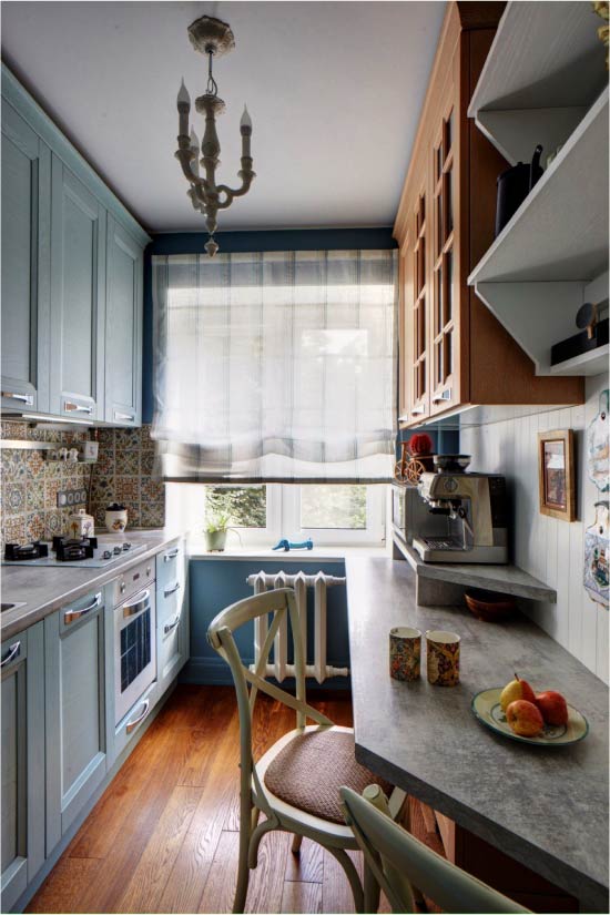
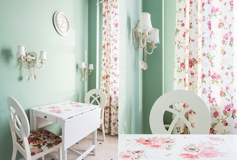
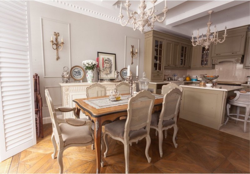
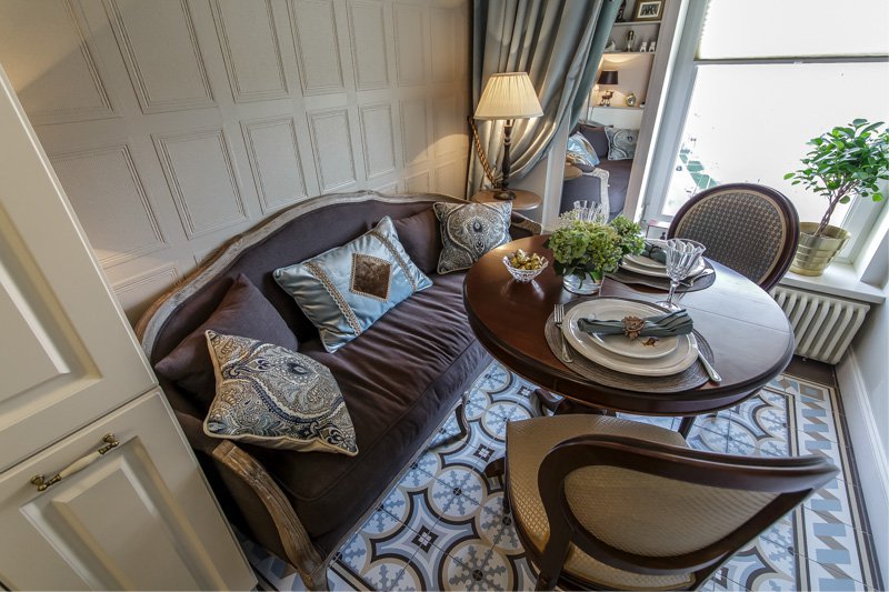
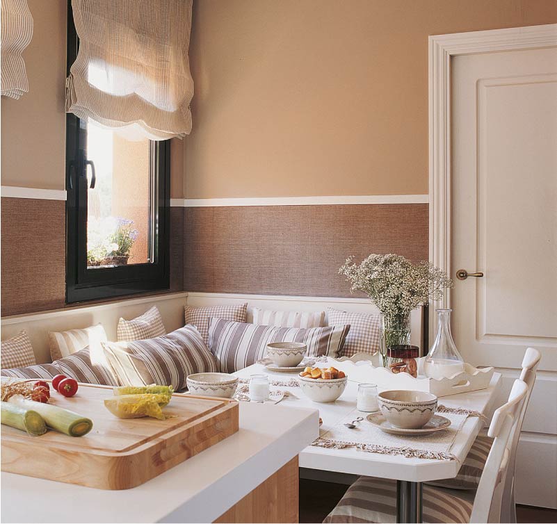
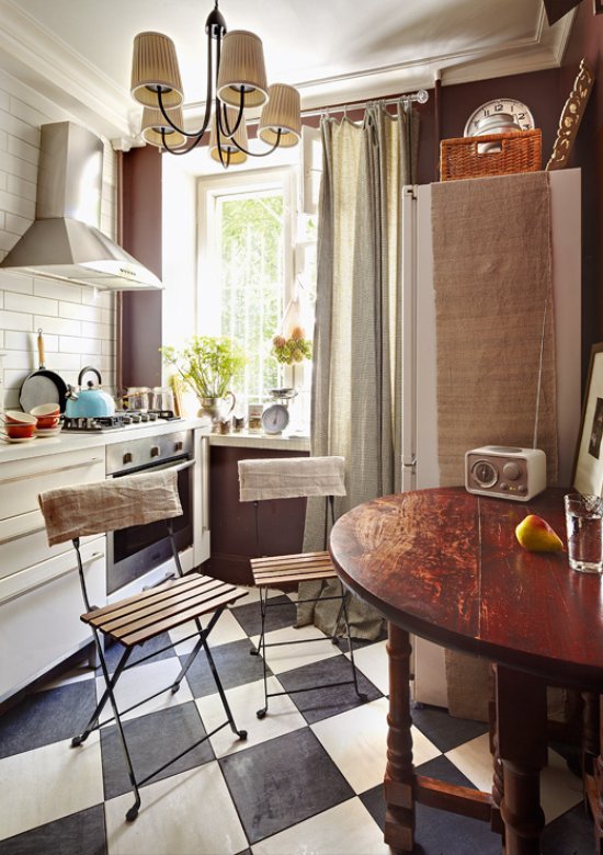
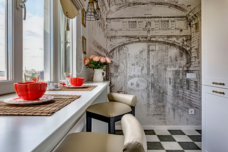
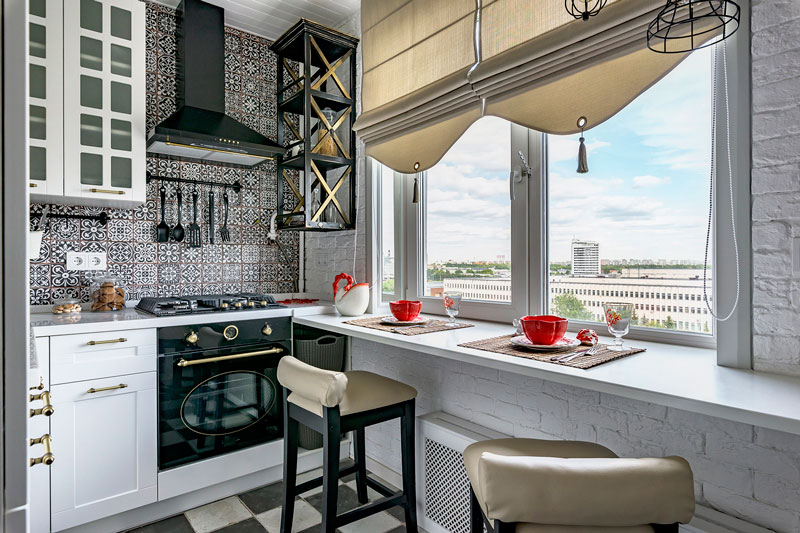
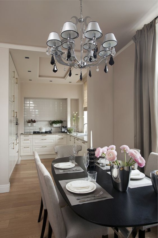
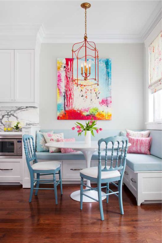
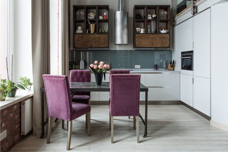
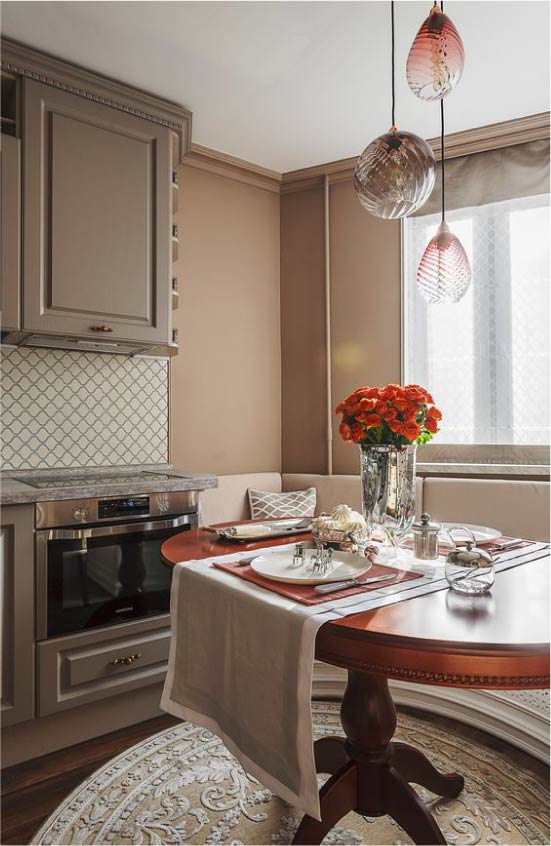
Below is a photo-example of the interior of the kitchen, in which there are 5 colors (scroll the photo to the right).
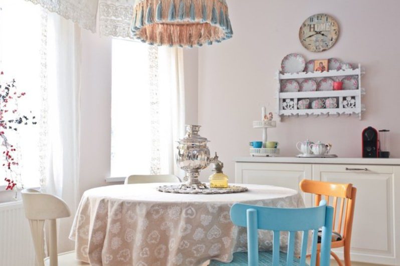 Kitchen interior with color accents and neutral base
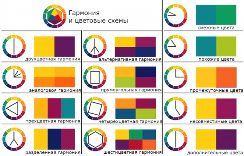
2. Match colors with the color wheel.
Composing the color combination in the kitchen, it is useful to know the principles of working with the chromatic circle, which schematically represents the rainbow spectrum. Buy it at the art shop and try to play with combinations of colors according to the following basic algorithms:
Scheme 1. Monochromatic combination of colors: the interior is decorated with shades of only one segment of the color wheel.

A kitchen with monochrome colors (for example, as in the photo below) is elegant and pacifying. But there is a danger: the interior may seem too simple and boring. To avoid this, combine dark shades with light ones, and add effective textures or some contrasting details to the monochrome space.
Small kitchen in shades of brown
Scheme 2. Contrast color combination: combines shades that are located opposite each other in a circle. Contrasting colors to each other are also called complementary.

An interior with such a scale is interesting and very expressive, but in order for it to be viable, the chosen colors should be, firstly, diluted with white or other neutral colors, and secondly, the shades should not be pure, but more complex, for example, subdued. , whitened or deep.Agree, it is unlikely that someone would sit at this kitchen for a long time (in the photo below) if its walls were painted not ocher and deep azure, but pure orange and pure blue.
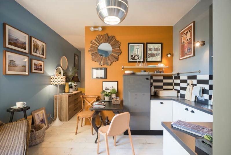
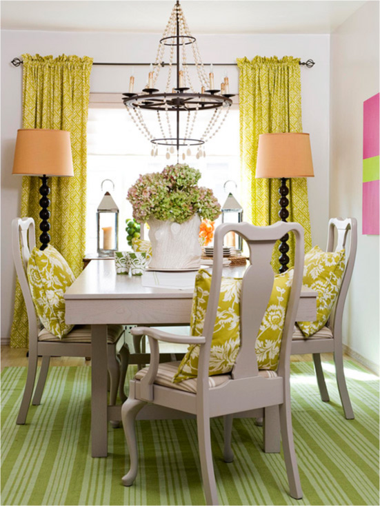
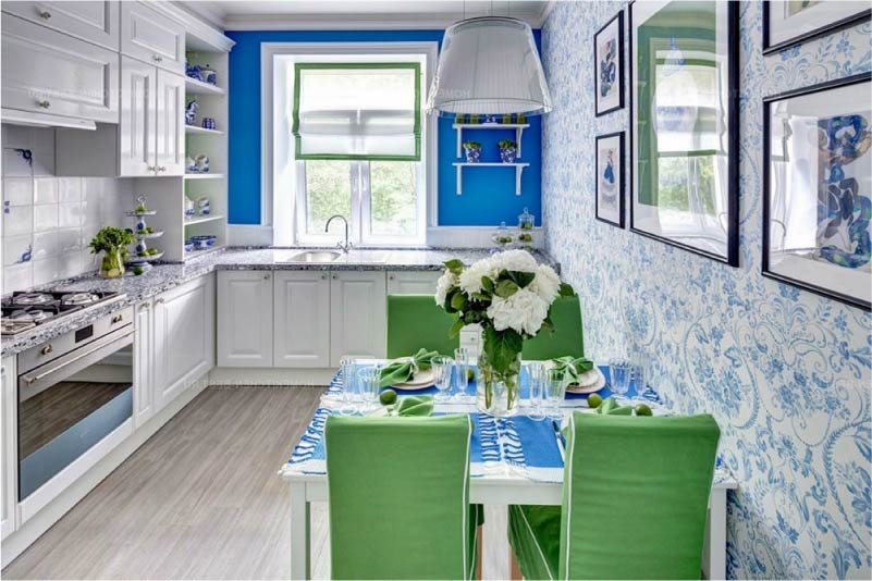
Scheme 3. The harmonious combination of colors: based on the use of "neighbors" in a circle, which is also called similar colors. Such combinations are the most versatile, but also require contrasting or bright accents, complementing with neutral colors.

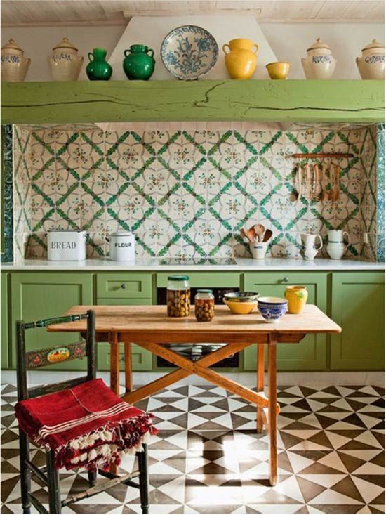
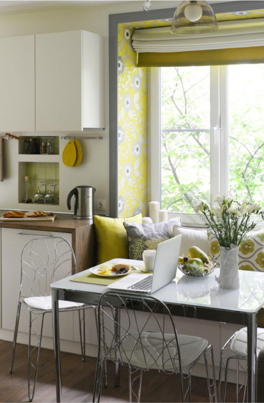
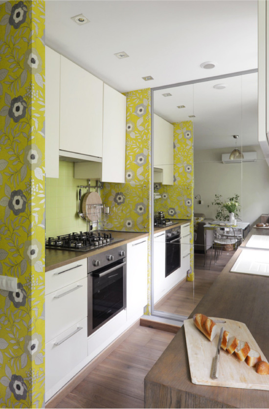
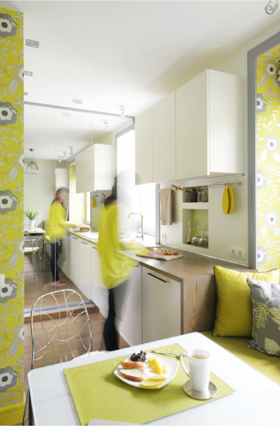
Yellow, green and orange are the neighbors in the circle, and therefore this interior is so pleasant to the eye.
In addition to the three color schemes described, there are other principles of color combinations: the principle of extremely distant pairs, intermediate colors, the principle of drawing up triads, the principle of a rectangle, a square and a hexagon, and others.
Color scheme
3. The color scheme of the interior must match the style.
Often, the range of colors dictates the style of the interior, so if you have already decided on his choice, it will be easier to create a palette:
- Classic Kitchens or style Art Deco decorated in deep but muted tones, the walls are painted with paints, as if made on the basis of natural pigments. Bright accents are not peculiar to classic interiors, but contrasts are allowed.
 Art Deco Kitchen
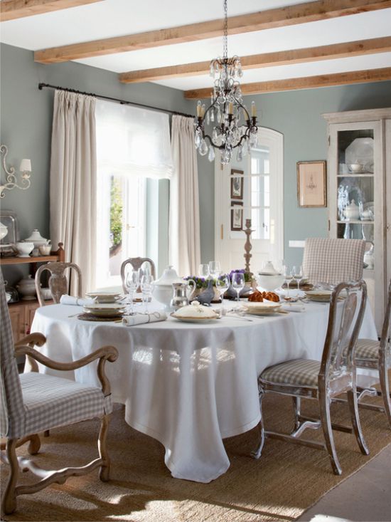
- For European styles shebbi chic and Provence, Gustavian and French are characterized by a pastel and neutral palette without too bright accents.
- Base colors Scandinavian style kitchensAs a rule, they are light and natural, but often with bright or contrasting accents.
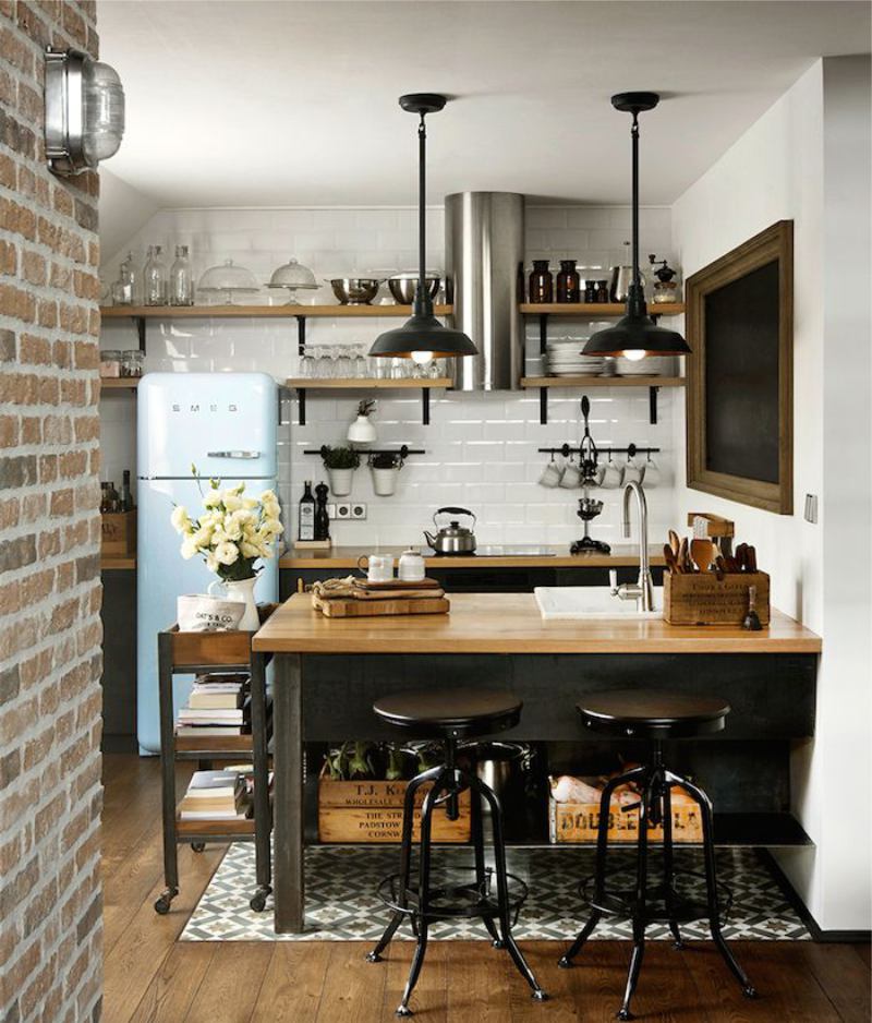
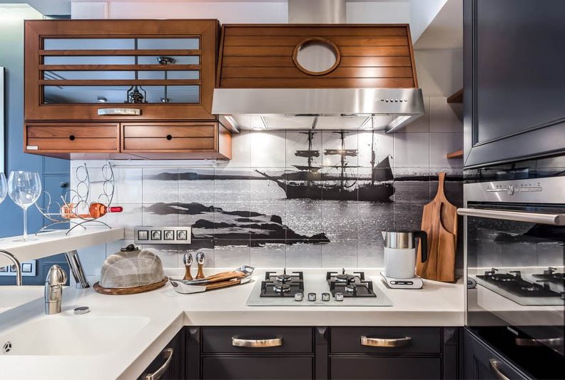
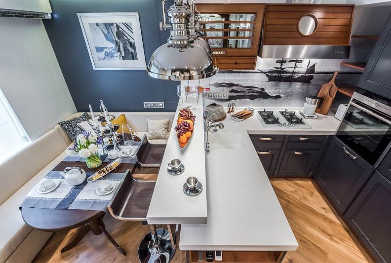
- Loft and industrial is built on dark, muted colors, often with lots of brick, wood, concrete and metal shades.
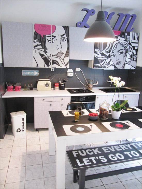
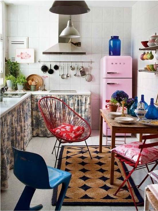
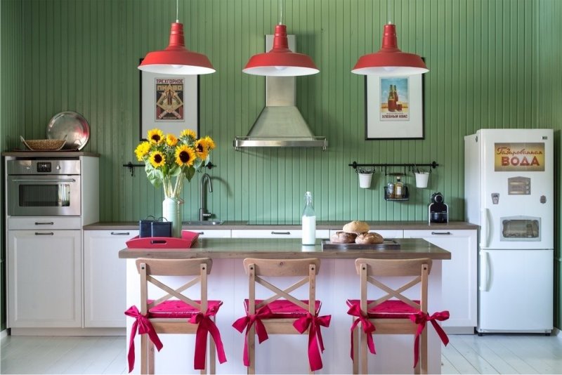
- Pop art, retro and boho-chic - directions for those who love bright and saturated colors as in the following selection of interior photos.
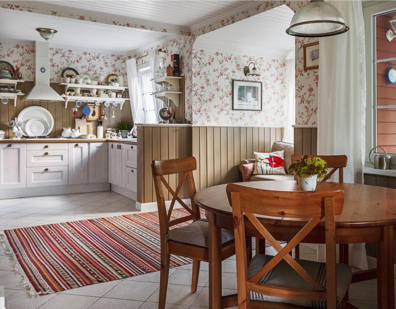
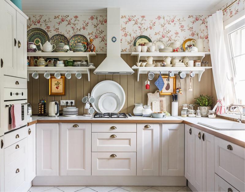
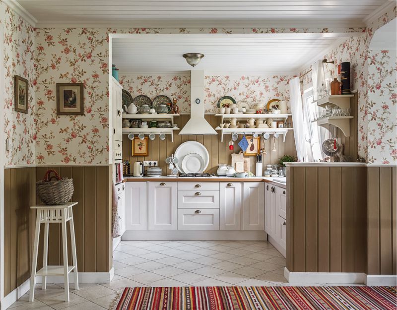
- Rustic and minimalistic style, eco style and country music based on shades of natural materials - sand, grass, clay, stones and, of course, wood.
After getting acquainted with the canons of the desired style and studying the photos of the interiors, you can learn some good ideas of combinations of colors and textures, and perhaps even find a ready-made solution.
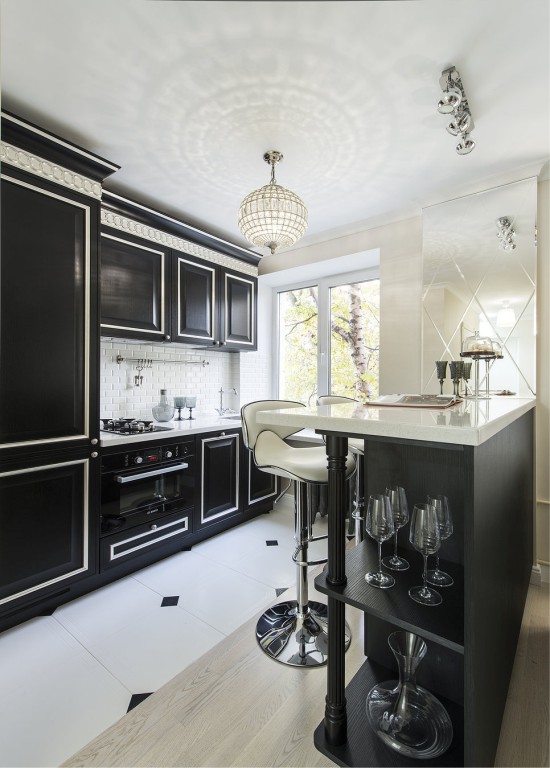
4. It is undesirable to decorate the floor of the kitchen and work surfaces in dark colors.
The fact is that on a dark background dust, fingerprints, stains, crumbs, water drops, stains, wool are very noticeable. To wipe the countertop, say, wenge color or tiled floor shade of wet asphalt to a state of perfect purity, will have to try very hard. If you often cook and are not ready to pay a lot of attention to cleaning, you should stay away from the dark floors, apron, countertops and facades.
The black color of the kitchen is very effective, but very difficult to clean, especially in gloss as in this photo.
5. Consider the orientation of the windows on the sides of the world and the level of illumination.
If the kitchen faces the north side, then a soft white color and warm saturated colors will help fill the lack of heat and light: yellow, red, orange, pink.
But it’s unlikely to make friends with white-white, shades of blue, blue, violet and gray — they will look cloudy in dim natural lighting and even create a feeling of cold. Also, do not get involved in pastel shades, because without sunlight, they will seem dirty and dull. But on sunny southern kitchens, cold shades will look fresh, and pastel shades - gently. Warm colors in bright light, on the contrary, may seem too active and oppressive or create a feeling of stuffiness.
Want to know for sure whether the chosen color of paint for the walls of your kitchen? Use a professional trick: paint an A4 sheet, hang it on the wall and watch how it looks in different lighting conditions during the day. Perhaps the color that looked so good in the store and on the brochures in the lighting of your kitchen will reveal quite differently.Also, this test is useful to conduct with samples of flooring materials, facades and other large objects.
Choosing the color of the walls for the kitchen, it is desirable to test the selected colors of paint in real conditions
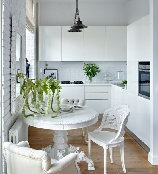
6. If the kitchen is small, then it is better to bet on light shades.
The most effective way to visually enlarge small kitchen - to issue the basis of the interior in white. In a space with white walls, a floor, a ceiling and a suite, the borders seem to disappear, and the light becomes much larger. To white kitchen It did not seem boring, in its interior it is necessary either to combine expressive textures and materials, for example, white bricks and gloss (see photo below), or - to use color accents and contrasts.
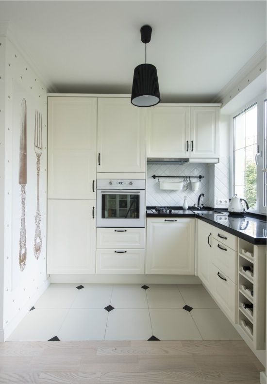
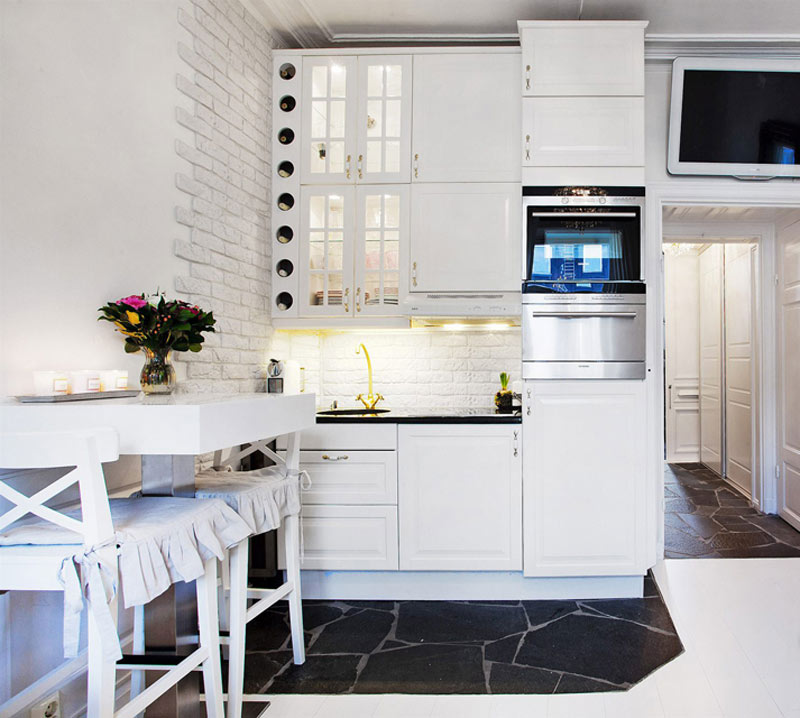
However, if you don’t like white color, you can replace it with light shades of gray, cream, beige, blue, lime and others.
Gray-blue color of the walls in the kitchen in a classic style.
7. Cold colors suppress appetite, warm ones excite
If you are an avid cook, a gourmet or just a fan of beautifully photographing food, then warm shades (yellow, red and orange, textures of wood and brick) in the dining or work area will be very useful. On the other hand, if you are aiming for a moderate diet, then you should choose an apron or, say, a tablecloth on the table in cold colors.
8. The starting point for planning the color scheme can be furniture that you have noticed in the store or, say, an existing finish.
If you do not plan to purchase custom-made furniture, paint the kitchen yourself, or if you already have some kind of finishing / appliances / furniture in your kitchen, then it’s more logical to make a start on the colors of their colors.
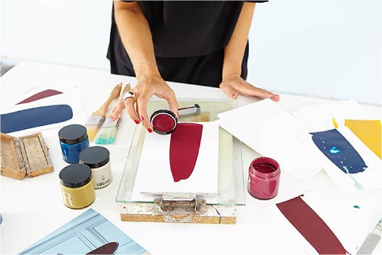
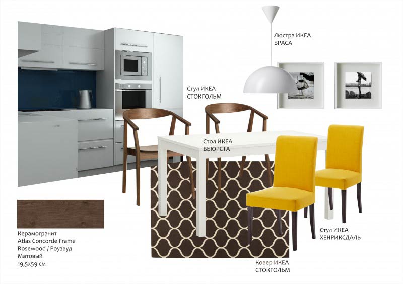
9. Create a palette or collage and always use them, buying finishing materials, furniture and decor.
Color and color combinations are impossible to remember, so you need to use cheat sheets in the form of a palette, collage, or a message board with samples of materials. There are special online programs for creating and searching ready-made palettes (for example, Kuler), but also you can use any image editor with the eyedropper tool. For a sample, the easiest way to take a photo of the interior you like (even not necessarily the kitchen) and select 3-5 colors. When the palette is ready, save it on your phone to check with it when choosing finishing materials, furniture and decor.
Drawing up the color scheme of the kitchen interior
The second way to help you not to be mistaken with hues and textures is to create a collage in any graphic editor: just place photos of all the elements of the interior (they need to be found on the manufacturers' websites) next to each other. The collage will help to present the future interior and show that you need to adjust the colors and the choice of materials / furniture.
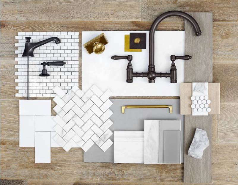
Ideally, instead of a collage, you should use the mud board - a board with samples of finishing materials (see photo). For example, it can be pieces of wallpaper, curtains, ceramic tiles, etc. As a result, you can find not only the perfect color of the kitchen, but also harmonious combinations of textures, and you can also choose things in the colors you need.
Characteristics and successful combinations of primary colors
Red
This color is nowhere appropriate in the kitchen, but you have to be careful with it. In small doses - it warms, invigorates, stimulates the appetite, in large doses - it crushes and irritates.
- Combinations: the aggressiveness of red is well neutralized by white and good-natured green, it can be supplemented with black details, and also be combined with cold colors and all related shades - yellow, orange, burgundy, brown.
See more details: Red color in the interior of the kitchen: 5 tips and 85 inspiring photos
Blue
Blue is a great color for a kitchen, but with good sunshine or moderate use. Blue is suitable for those who struggle with the habit of overeating, who loves calm and needs self-confidence.
- Combinations: with white, with cold colors - gray, green, blue and purple, and also warm antipodes - orange, yellow, brown, red.
Blue and blue color in the interior of the kitchen
See more details: How to enter the blue color in the kitchen interior - 5 tips and 60 photos
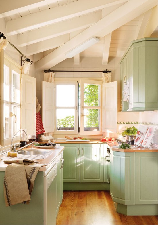
Green
It is ideal for the kitchen, as it sets up a positive mood, which is always necessary at breakfast before going to work and at dinner - before going to bed. Unlike warm and cold colors, green acts on the appetite neutral.
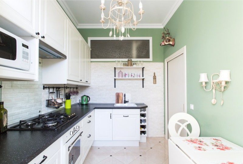
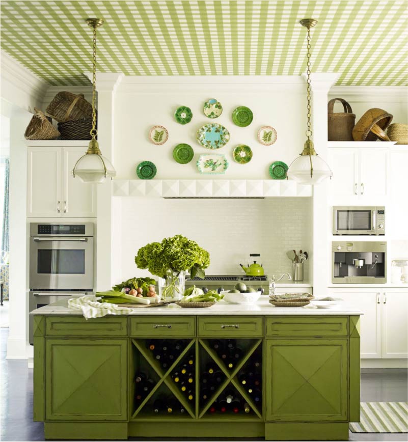
- Combinations: the ideal pair for green is red, it also combines well with the “neighbors” blue and yellow, the warm hues orange and brown (it's no wonder the green-brown couple dominates the world of flora).
See more details: Green color for a perfect cuisine - 5 main tips and 100 photos
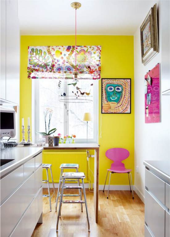
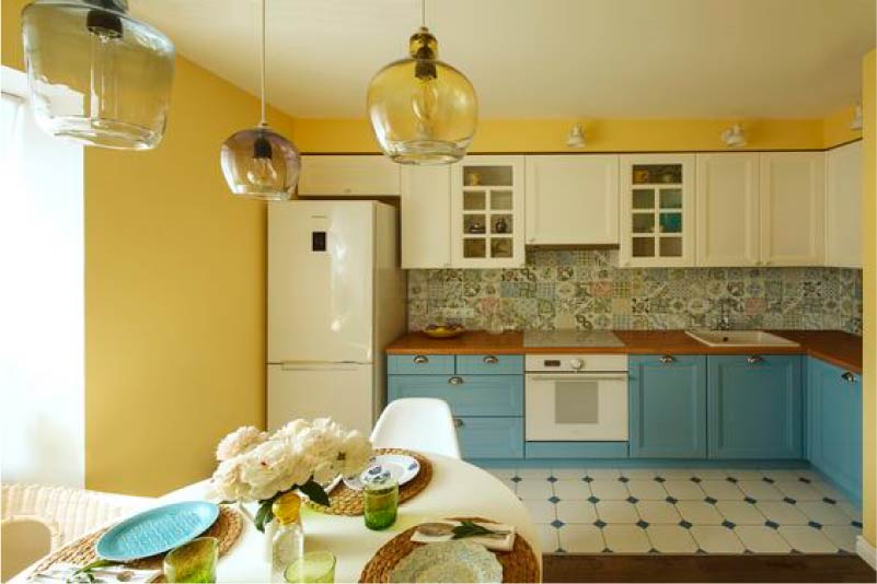
Yellow
It invigorates, cheers, warms, any food on such a background seems appetizing, but in a large number yellow can irritate the psyche. This color is especially shown in the northern and dark kitchens - here it can replace sunlight.
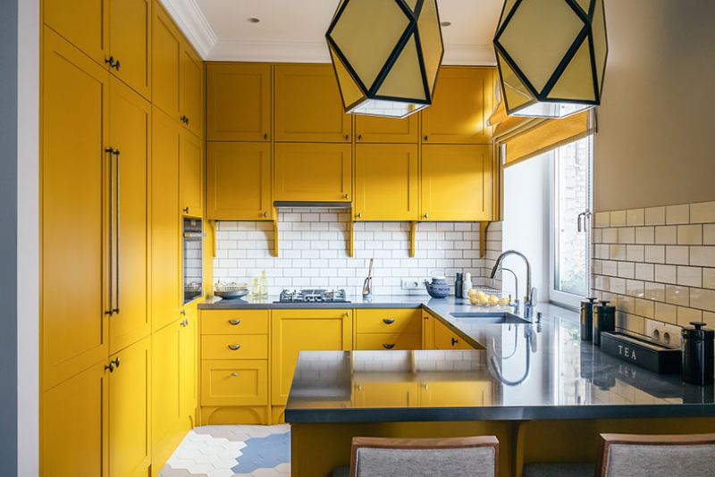 Yellow kitchen
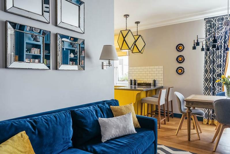
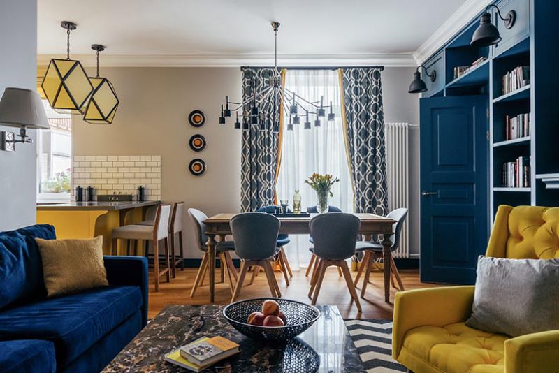
- Combinations: with red, blue, blue, lilac, purple, green, brown and, of course, with gray (with it it becomes more serious), white and black.
See more details: Yellow color in the interior of the kitchen - 5 main tips and 100 photos for inspiration
Gray
Light gray is the perfect color for kitchen walls and a headset.
Gray is always practical and versatile, moreover, almost all colors together with it become more noble and effective. However, the abundance of gray (except for very light colors) can inhibit and cool. For dark kitchens shades of gray are contraindicated.
- Combinations: Gray combines with all the colors of the rainbow, but is especially good with white (gray walls with white plinths look stunning), pink, yellow.
See more details: All about the use of gray in the interior of the kitchen
Violet
This color is almost the most difficult to use, as it has a contradictory effect - it simultaneously excites and soothes. Therefore, it is worth using it only in very small quantities.
- Combinations: with neutral colors — white, gray, brown, with its complementary color — yellow, and its “parents” red and blue.
Purple color in the kitchen interior
See more details: Violet color in the interior of the kitchen - 5 secrets of use
Brown
The color of the earth and the tree soothes, creates in the interior a sense of security and comfort. Especially good to use it in textiles, in the decoration of the floor and furniture. However, in large quantities and without suitable complementary colors can tire.
- Combinations: with white, beige, green, with related warm shades and opposites - blue and blue.
See more details: 7 secrets of brown in the interior of the kitchen
The black
If you use this color in moderation and combine it with brighter or more cheerful colors, then black can bring elegance and severity to the interior.
Black furniture in the interior of the kitchen in the country
It looks especially stylish in a “chess” decoration of the floor and an apron, in the form of décor (photo frames, statuettes, vases) and in the form of prints on textiles / wallpaper.
- Combinations: blends with all colors.
See more details: Black color in the interior of the kitchen - 150 photos, 3 rules and 6 successful combinations
Photo Gallery

 (Rate the material! Already voted:80 average rating: 4,74 from 5)
- How to choose the wallpaper in the color of the kitchen - 112 photos and 7 rules
- All about interior design white kitchen
- Orange color in the kitchen interior
- 11 design tips on the design of black and white kitchen
- White kitchen in a classic style - we study the theory and put it into practice
- Create a unique design in the kitchen - correctly combine the wallpaper
- IKEA Kitchens: a photo in the interior and a certificate for the buyer
Perfectly chosen color scheme, useful tips on how to choose the right colors. Cool site!
I saw bright scarlet kitchens. Just a matchless color combination. But for a long time to be on it will be difficult.
I wanted the kitchen in shades of green, but I read the article, and I realized that for the north side I needed to select lighter tones. I liked the photos of beige kitchens. I think I’ll stop on this color.
thank)
Thank you so much for the material, I really liked the selection of yellow-white and green-white kitchens. I want to paint the window frame for a long time in a bright color, so I feel that this is not enough, especially in the fall of my melancholic nature - and then I saw and most likely realize it.