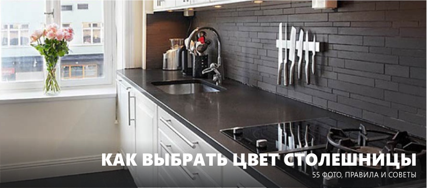
After you decided on the material of the countertop for the kitchenit's time to choose its color. What should it be - to match the headset, apron, or, perhaps, the floor? What is the most practical color tabletop? How to fix the situation if the work surface does not fit into the interior? In this article you will find a complete guide on the choice of tabletop colors for the kitchen, as well as a selection of 55 photo ideas.
5 important tips
1. A worktop must repeat the color of at least one kitchen element.
Ideally, two elements. This is not a strict rule, but a win-win principle of achieving excellent results. For example, you can choose the color of the tabletop, focusing on:
- Facades of kitchen set;
- Apron;
- Windowsill;
- Dining group (especially table top);
- Floor.
These “landmarks” are the most traditional, therefore we will tell about each of them in more detail and more clearly in the second half of the article. And now let's open another secret: in fact, the working surface can be chosen to match any element of the kitchen interior - from curtains and finishing with wallpaper. Moreover, this principle also works in the opposite direction: you can choose any shade of the tabletop and choose the decoration of the walls, furniture or, say, mats for plates.
Can a tabletop have a color that no longer repeats in the interior and look harmonious at the same time? Yes, maybe, especially if white kitchen. But still, if you are not 100% confident in your taste, you should use a proven formula.
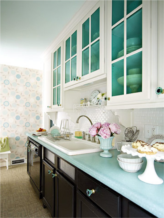
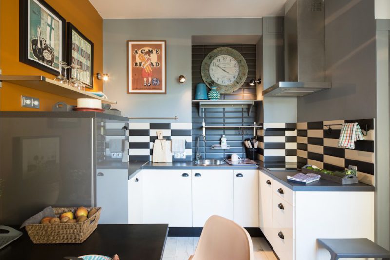
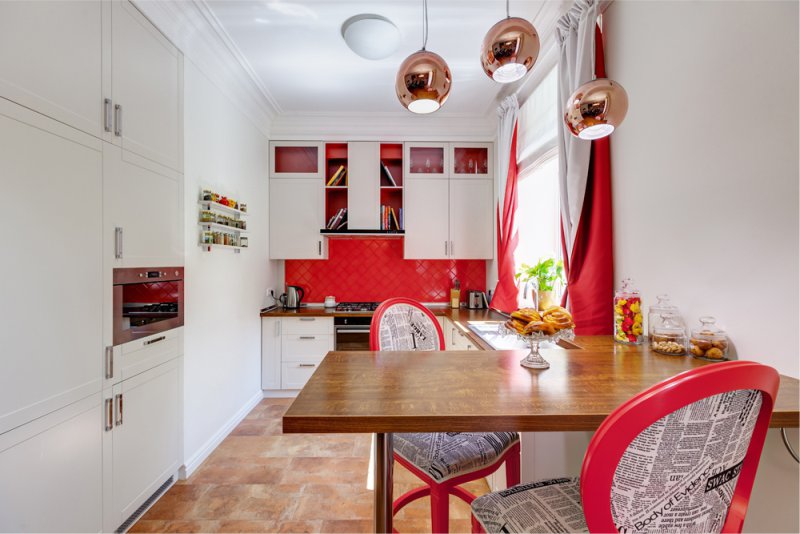
2. Kitchen worktop can be contrasted with an apron or facades
This principle allows you to create the most interesting and pleasing to the eye color combinations, but to apply it is somewhat more difficult. That is, if everything is clear with white and black surfaces, what about other colors? To determine the contrasting shades to the apron or facades, you need to use the color wheel and the following rule:
Colors opposite each other are contrasting.
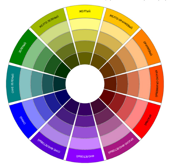
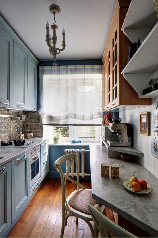
Thus, if the kitchen or apron is blue, then the countertop must be chosen in a warm orange shade as in the photo below. For green kitchen worktop red shade, for example, granite or mahogany.
You can read more about working with the color wheel and contrasts. in this article.
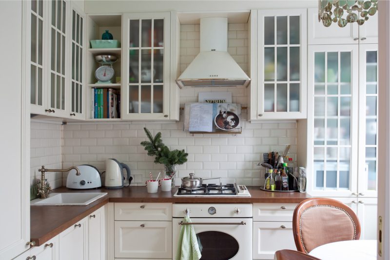
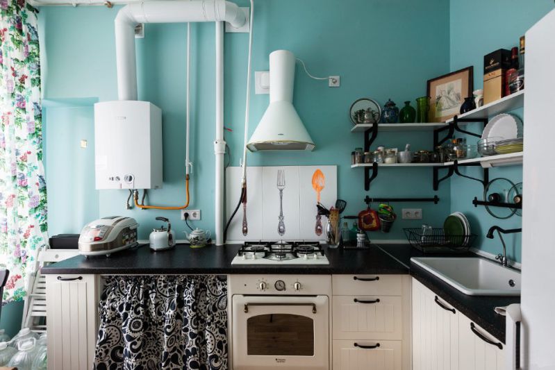
3. What is the most practical color countertop? Whatever, but not dark!
For some reason, among the buyers of kitchen furniture there is a common myth about the margins of white surfaces and the practicality of dark ones. However, in reality, the situation is quite the opposite: white countertops are easy to clean, and dark countertops are incredibly capricious. Against this background, tiny crumbs, water droplets, stains and dust are noticeable, especially in the light of furniture LEDs. Kitchen vendors in showrooms know this firsthand and rub exhibition samples almost every 15 minutes. Just imagine what will happen to a spectacular tabletop, say, the color of wenge in real conditions!
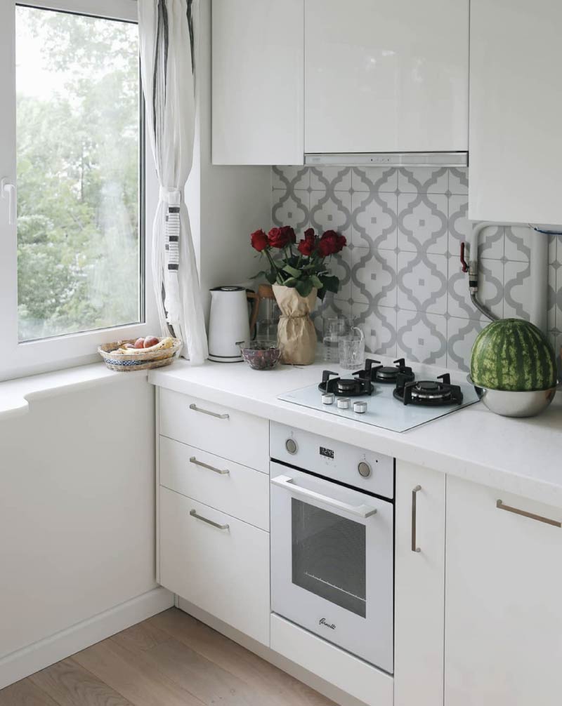
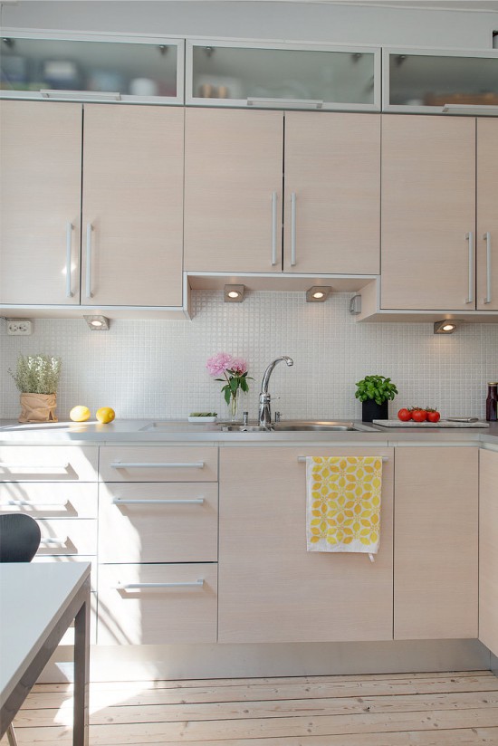
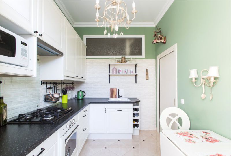
- The practical colors of the tabletop are: beige, bleached wood color, natural brown, gray and light gray, matt white, and white with veins and specks.
- Brand colors: All dark shades are equally difficult to clean, but the hardest thing to keep clean is black solid worktops.
If you still want to buy a dark tabletop, then we advise you to choose a model with light veins or specks. For example, it may be a tabletop of agglomerate under granite. It is better to avoid dark surfaces made of laminated chipboard, as this material attracts dust more quickly.
4. Choosing the color of the table top in the store, it is advisable to take with you a sample of the floor, apron, wallpaper, or other “companion”
A companion is an element of the interior that in the future will “support” your countertop in color (as we have said, it is better that there are 2-3 companions). If you take a sample of your “reference point” with you to the store, then it will be much easier and more accurate to choose a working surface to it exactly in tone or as close as possible to it. By the way, you can do even better: ask for samples of your favorite tabletop models and test them at home.
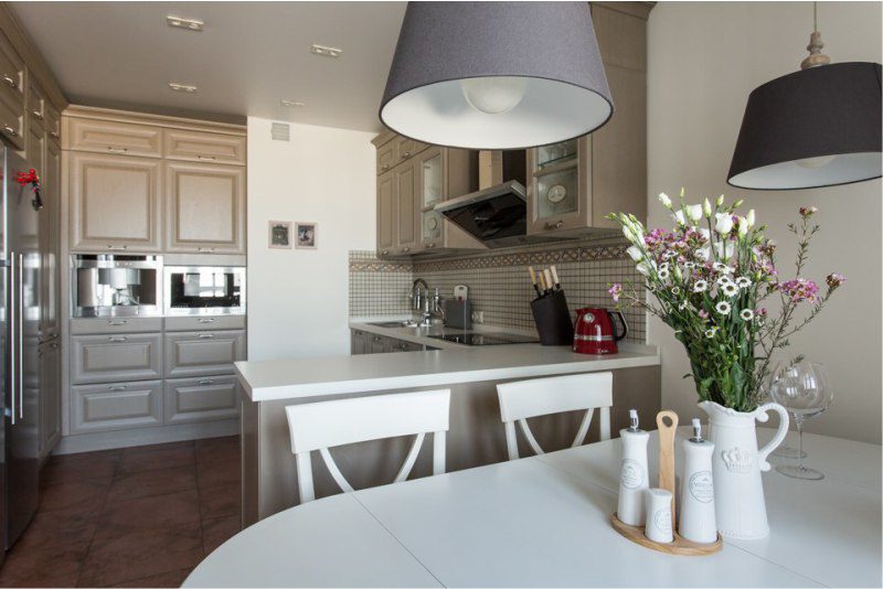
5. The most versatile tabletop colors are white or gray.
If you do not know what color to choose for the kitchen countertops, choose the one that fits for sure:
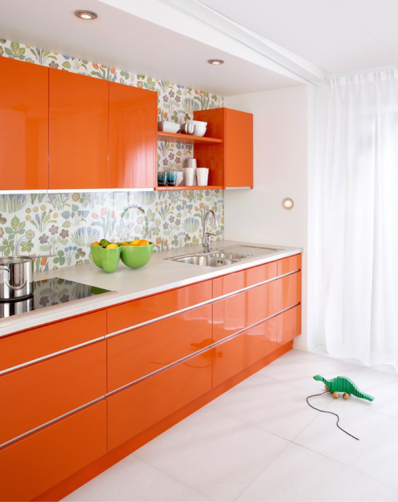
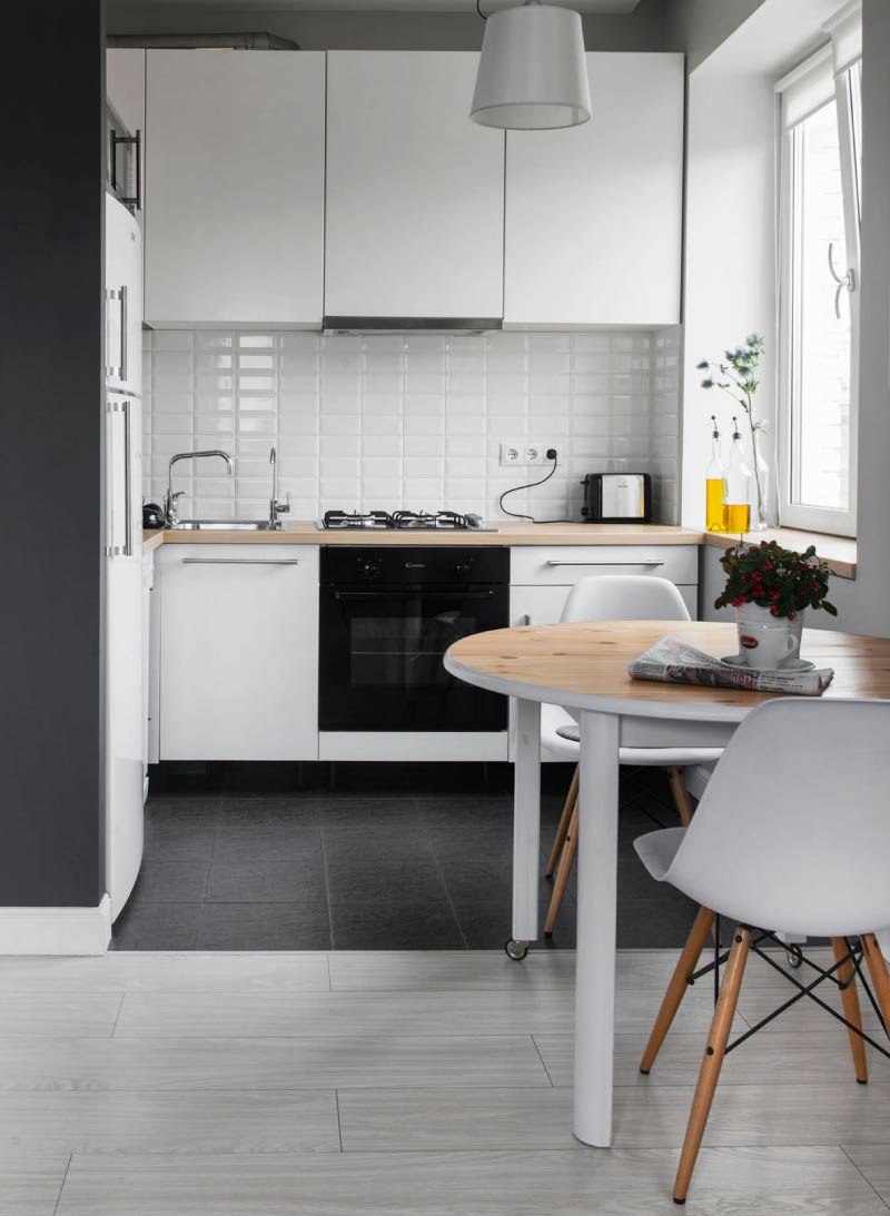
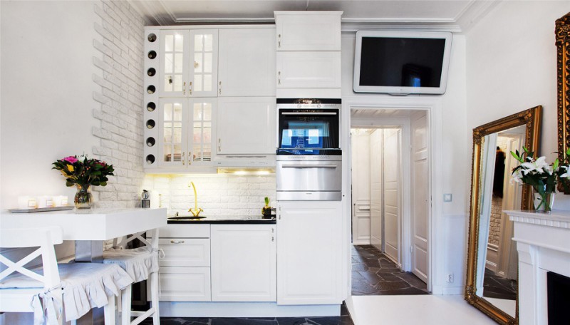
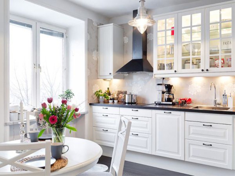
- White. This color is the most versatile, but white countertops are especially good for dark, colored and white kitchens. By the way, they can have a natural pattern, but they can be monophonic.
- Gray. Gray countertops are universal in themselves and, moreover, they have an excellent relationship with household appliances (with a gray-silver case), metal furniture of the kitchen.
How to choose the color of the tabletop under the kitchen set, apron and other interior elements
Under the kitchen suite
There are different ways to choose a tabletop for kitchen:
- Tone in tone to the facades of the headset;
- In tone of the lower tier or individual cabinets.
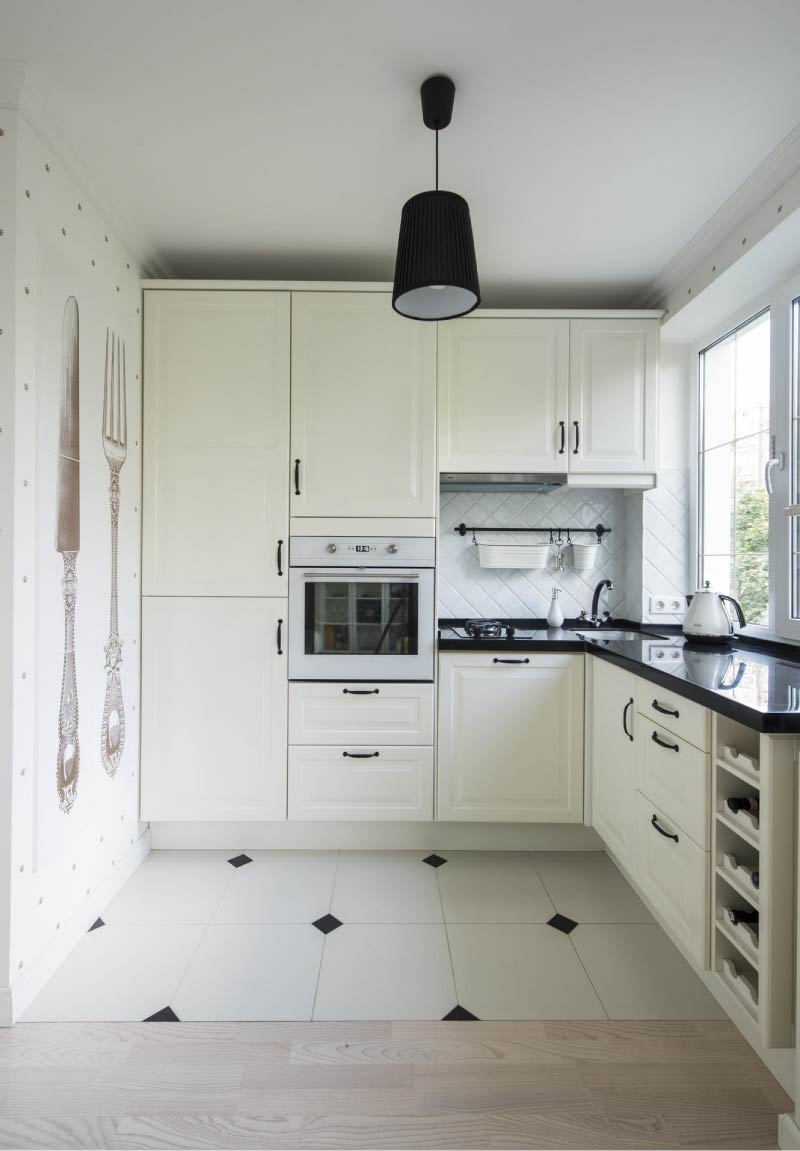
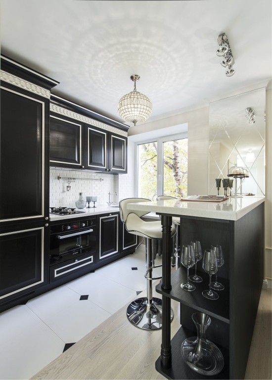
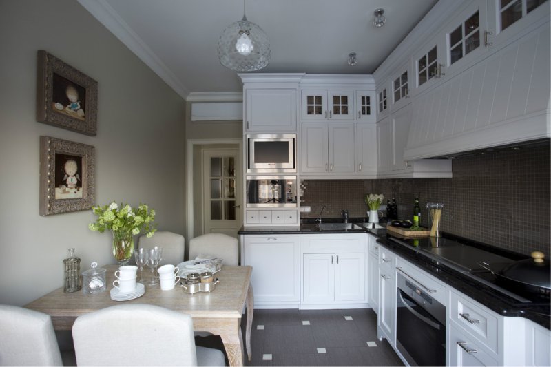
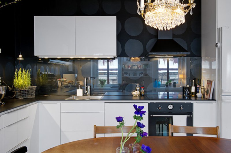
At first glance, it seems that the easiest way to find a tabletop tone in tone to the facades. But, as practice shows, it is difficult to achieve a 100% coincidence due to the difference in textures of materials and the limited selection of shades of table tops. The exceptions are the white and black kitchens - it’s easy to find the countertop of the same tone.
White kitchen with white worktop
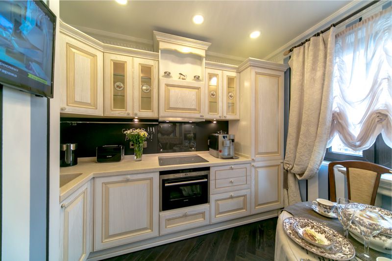
However, shades as close as possible to each other can also look good. In this case, the sample of the tabletop you like should be “tried on” to the facades. There is another nuance - since the tabletop and the facades of the same color make up a monochrome ensemble, it is worthwhile to introduce other contrast or bright accents into the interior, for example, it can be an apron or separate headset cabinets.
If the facades of your kitchen are decorated in different colors, then the coolest decision you can make is to choose a countertop to match the accent cabinets or cabinets of the lower tier. This kitchen looks harmonious and not banal.
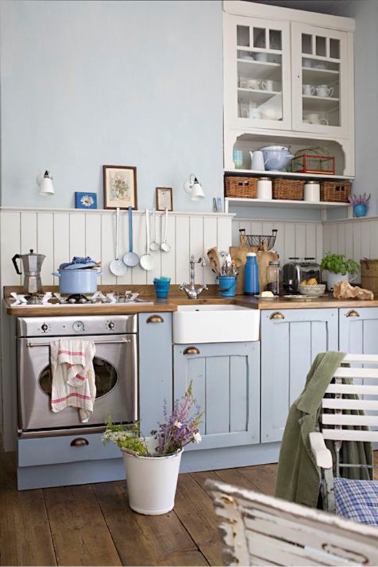
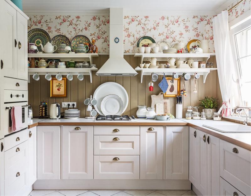
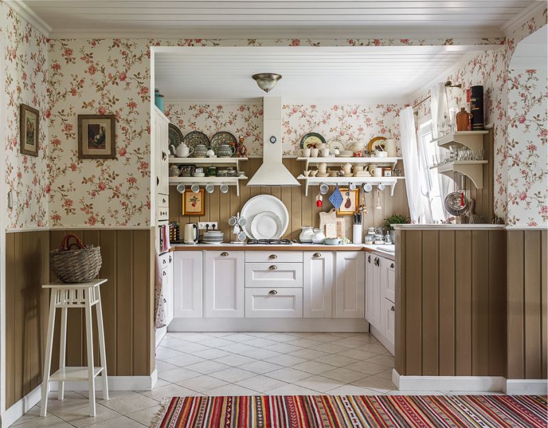
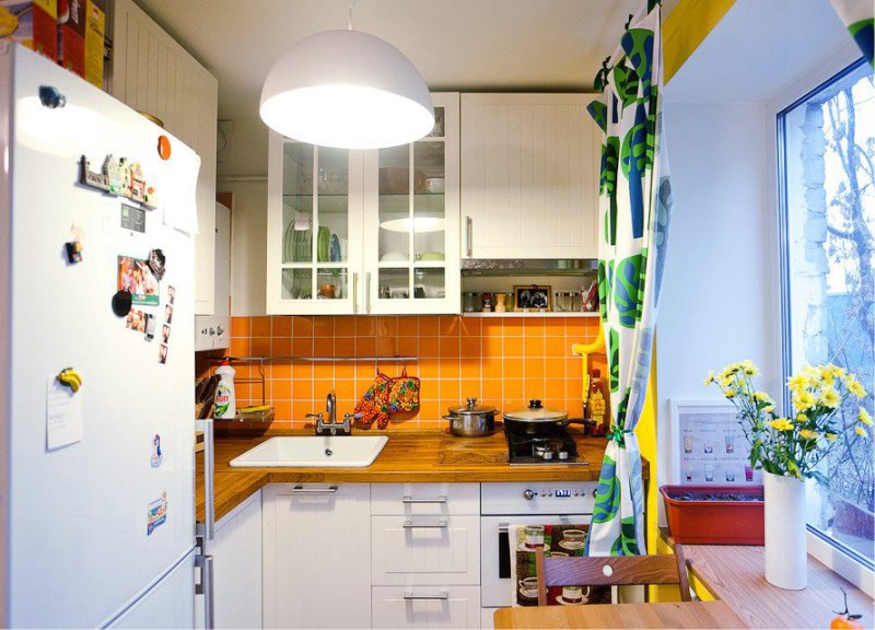
Under the apron
It is easiest to choose the color of the tabletop under the apron for two reasons:
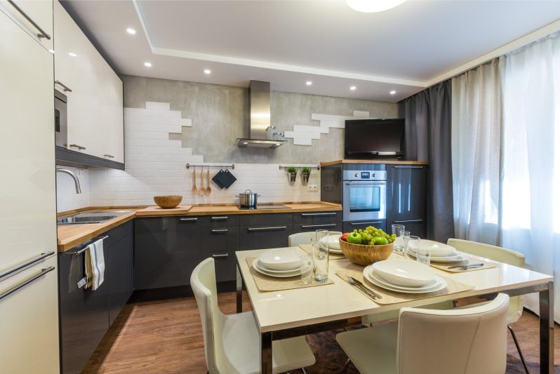
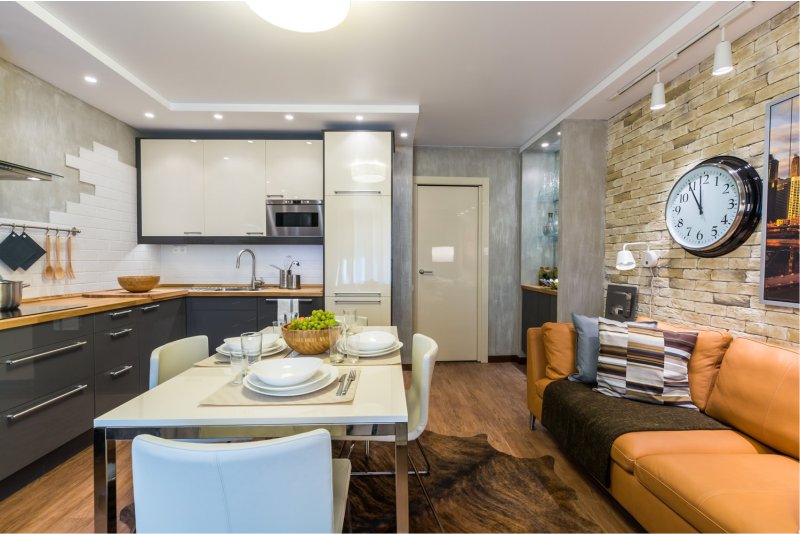
- They can be made of one material, which means that the problems of combining shades and textures will not arise.
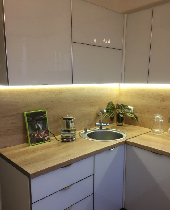
- The apron and the worktop can become a single and central element of the kitchen. Visually, this combination looks orderly, since it does not “crush” the interior. In addition, it greatly simplifies the choice of the color of the apron, and in general kitchen design planning.
By the way, it is not necessary that the tabletop and apron were decorated in one color. For example, if the apron is lined with motley tiles, then the tabletop can be decorated with the color that is in the wall composition.
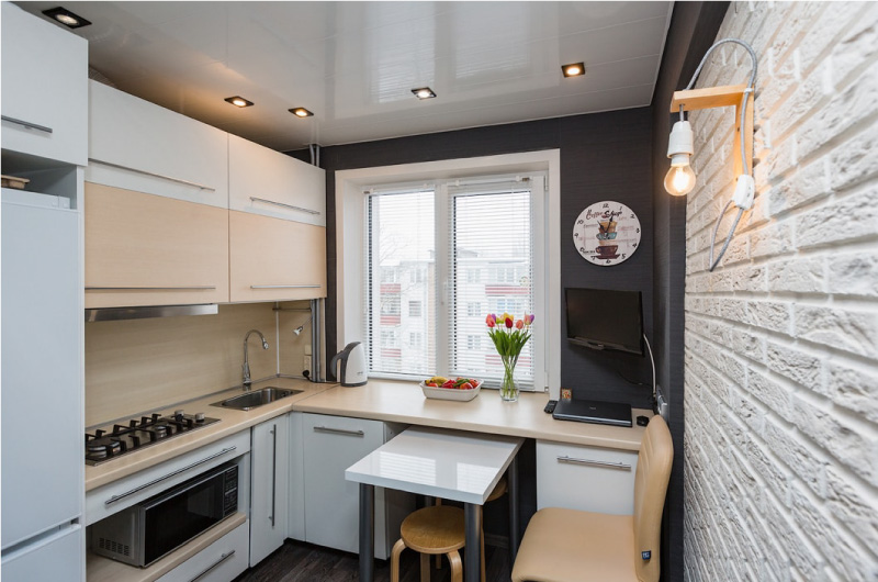
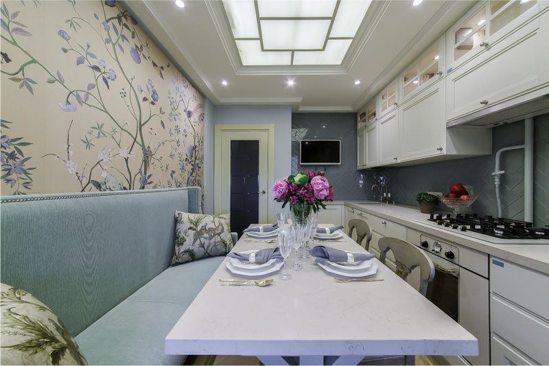
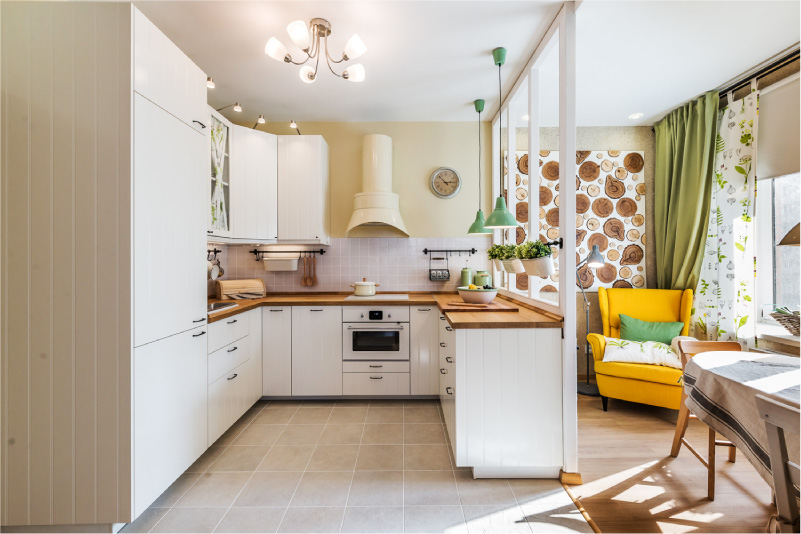
Under the floor finish
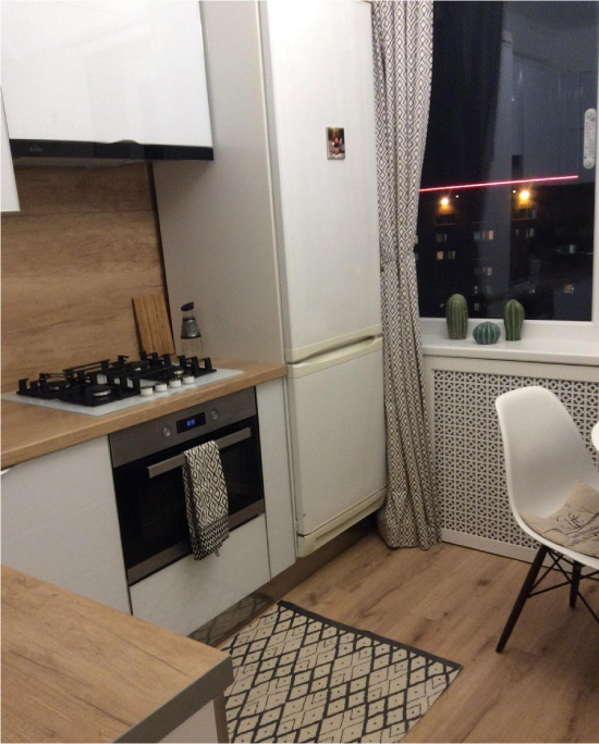
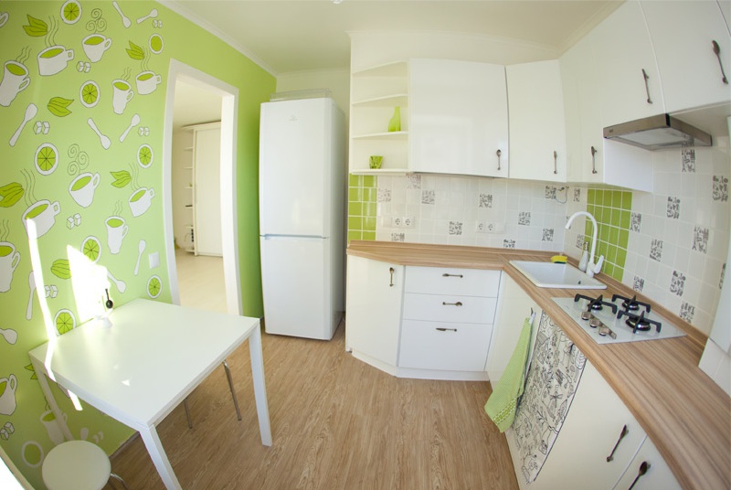
Another good thing is to choose the color of the tabletop to match the floor or the hue closest to it. For example, it can be such combinations:
- Laminate floor + table top from chipboard;
- Wood flooring on the floor + Tabletop of the same wood type (or just in a similar shade);
- The floor in the tile / porcelain + table top of natural / artificial stone to match the floor.
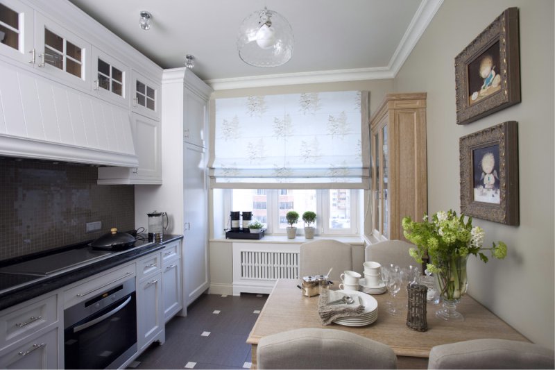
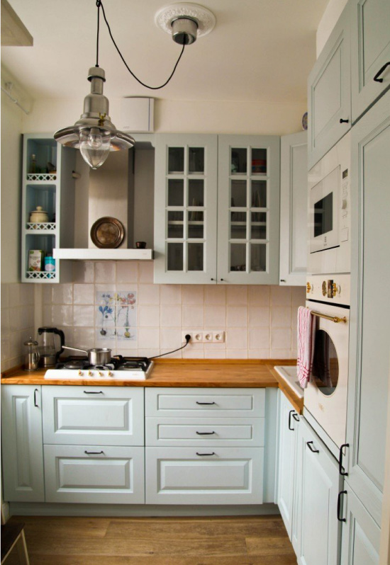
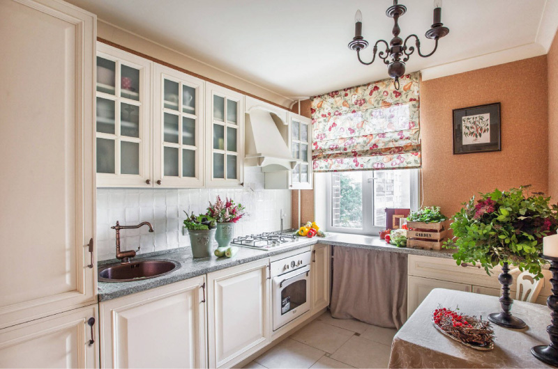
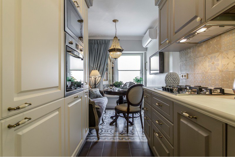
Under the window sill
There is something in common between a kitchen worktop and a window sill: they are often approximately at the same level, located close to each other, used to storage of things. And they can be made in the same shade and from the same material.
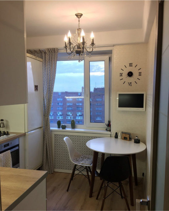
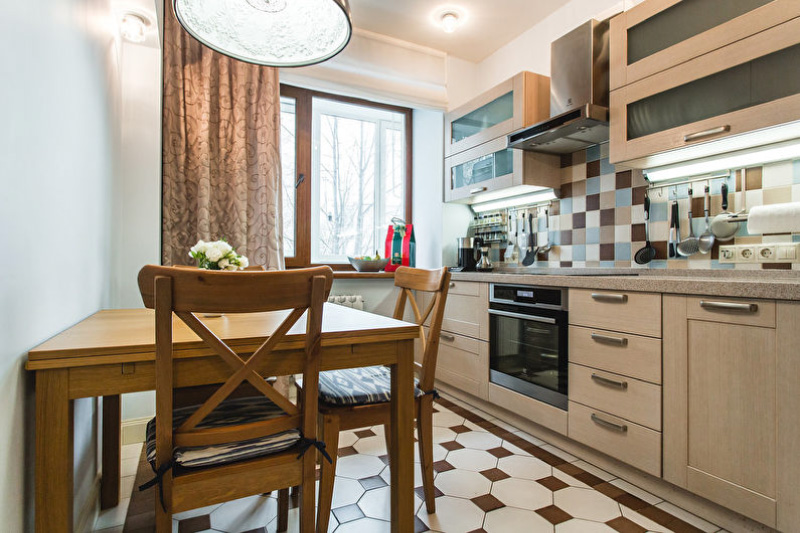
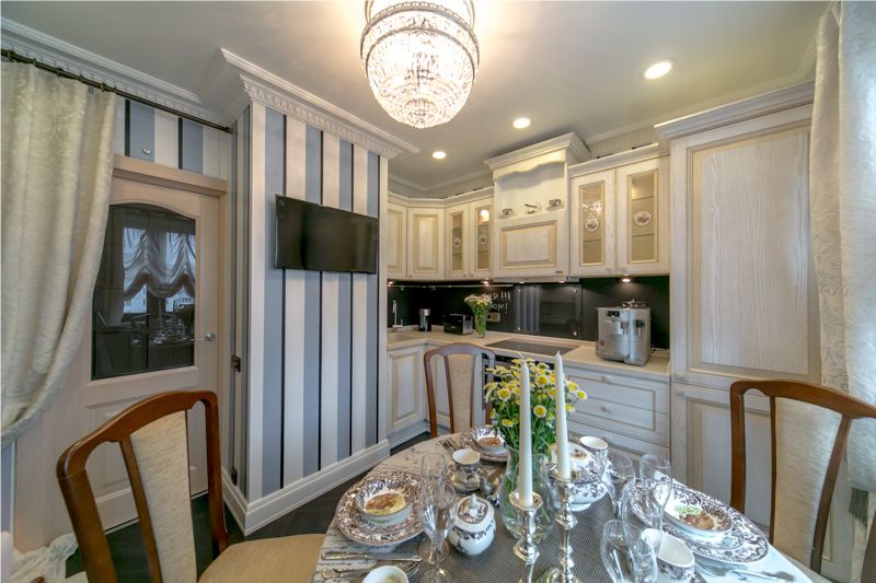
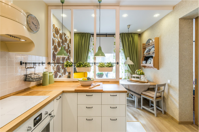
Under the lunch group
The dining group is another visual component of the kitchen interior.
Most often, a single ensemble consists of a table top and a table as shown in the photo below.
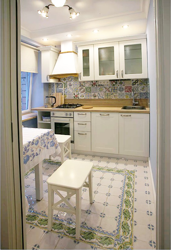
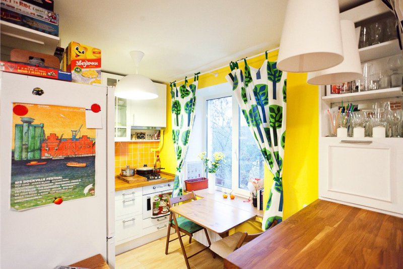
Tabletop to match the dining table in the interior of the kitchen in Khrushchev
Also, the tabletop can be chosen in the color of chairs, benches, stools or sofa. Such a solution is good because it looks harmonious and at the same time at ease. Here are some examples of such combinations.


 (Rate the material! Already voted:5 average rating: 5,00 from 5)
- Guide to the choice of artificial and natural stone for finishing the apron
- Self-installation of kitchen countertops - from cutting to insertion sink
- Wooden Counter Top Guide
- Stone countertops in the kitchen - practicality and natural charm
- Guide to choosing the perfect plastic worktop
- All about planning and arranging the window sill-countertops in the kitchen